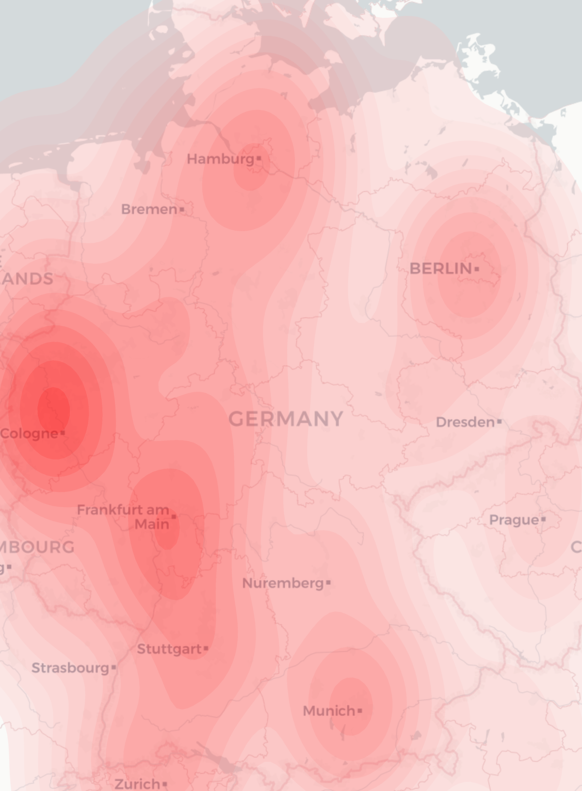

For a project recently I needed to produce a geographical heatmap with millions of data points. I first tried using R with OpenStreetMap rendering, but I couldn’t make the heatmap display as flexibly as I wanted. Then, a friend suggested I try using python with the geopandas library. Even then, inspite of some examples in the manual and even a heatmap-based example, I couldn’t make the map look how I wanted with the interfaces that were exposed.
There were a number of issues:
- My data was weighted, but there is no support for a weighted heatmap – all points are considered equal
- I want to have a nicer map which has town names on etc. Ideally the cartodb light style
- My data was heavily weighted to certain locations, so I wanted to run some logarithmic function on the weights generated by the heatmap algorithm to make the data more easily visible
- The standard heatmap setup assumes there is nothing other than a map outline so by default is not transparent at all
- I want to include this data in a report so all I want is a single png image output, rather than having the axis lines, various paddings etc on the graph
So, looking through the geopandas code (which mostly relies on seaborn kdeplot) to generate heatmaps I pulled out various bits into my program so that I could have full control over these processes. Here is a short runthrough of the resulting code:
First, we include libraries, read command-line values and set up the area of our map as a geopandas object
import contextily as ctx
import geopandas
import matplotlib.pyplot as plt
import numpy as np
import pandas
import scipy.stats
import seaborn.palettes
import seaborn.utils
import sys

input_file = sys.argv[1]
output_file = sys.argv[2]
langs = sys.argv[3].split(',')
country_codes = sys.argv[4].split(',')

max_tiles = 10

world = geopandas.read_file(geopandas.datasets.get_path('naturalearth_lowres'))

if country_codes[0] == 'list':
    pandas.set_option('display.max_rows', 1000)
    print(world)
    sys.exit()

# Restrict to specified countries
if country_codes[0] == 'all':
    area = world[world.continent != 'Antarctica']
else:
    area = world[world.iso_a3.isin(country_codes)]
Then, we pull out the bounds both in latlng format and convert the area into Spherical Mercator for web display. We need to plot everything in this so that we can pull in open street map tiles for the background later.
latlng_bounds = area.total_bounds
area = area.to_crs(epsg=3857)
axis = area.total_bounds

# Create the map stretching over the requested area
ax = area.plot(alpha=0)
We now read in the CSV and drop any data that we wouldn’t display:
df = pandas.read_csv(input_file,
    header=None,
    names=['weight', 'lat', 'lng'],
    dtype = {
        'weight': np.int32,
        'lat': np.float64,
        'lng': np.float64,
    }
)

df.drop(df[
            (df.lat < axis[1]) | (df.lat > axis[3]) | (df.lng < axis[0]) | (df.lng > axis[2])     # outside bounds of country
    ].index, inplace=True)
NOTE: I tried doing .to_crs() on the CSV data using normal lat/lng representation to convert into Spherical Mercator but it was very slow. As I’m generating the data itself from PostGIS I just run the conversion in that instead. The data I have is basically using the freely available MaxMind geoip database to generate a list of lat/lng/radius. I then pick a random point within that radius to output to the CSV file using a query like:
SELECT ST_AsText(ST_GeneratePoints(ST_Transform(ST_Buffer(location, radius)::geometry, 3857), 1)), ...
Then comes the hard bit – converting these values into the heatmap using an algorithm called KDE. These bits were lifted and simplified from the kdeplot routines mentioned above, but fortunately although not exposed by seaborn the underlying scipy.stats module contains a weighted KDE which is easy to use.
# Calculate the KDE
data = np.c_[df.lng, df.lat]
kde = scipy.stats.gaussian_kde(data.T, bw_method="scott", weights=df.weight)
data_std = data.std(axis=0, ddof=1)
bw_x = getattr(kde, "scotts_factor")() * data_std[0]
bw_y = getattr(kde, "scotts_factor")() * data_std[1]
grid_x = grid_y = 100
x_support = seaborn.utils._kde_support(data[:, 0], bw_x, grid_x, 3, (axis[0], axis[2]))
y_support = seaborn.utils._kde_support(data[:, 1], bw_y, grid_y, 3, (axis[1], axis[3]))
xx, yy = np.meshgrid(x_support, y_support)
levels = kde([xx.ravel(), yy.ravel()]).reshape(xx.shape)
The levels output variable is then the weights of all points on the heatmap we are going to output. We can apply a mathematical function to this (in this case take the quintic root) in order to scale the data appropriately, and output:
cset = ax.contourf(xx, yy, levels,
    20, # n_levels

    cmap=seaborn.palettes.blend_palette(('#ffffff10', '#ff0000af'), 6, as_cmap=True),
    antialiased=True,       # avoids lines on the contours to some extent
)
By generating a palette ourselves we can add an alpha channel to each aspect so that the underlying map will be visible. However there is quite a lot of noise at the lower levels so we want to hide all of them completely:
# Hide lowest N levels
for i in range(0,5):
    cset.collections[i].set_alpha(0)
We then add in the OSM base tiles, which is a bit of a mess as the contextily library seems a bit immature:
def add_basemap(ax, latlng_bounds, axis, url='https://a.basemaps.cartocdn.com/light_all/tileZ/tileX/tileY@2x.png'):
    prev_ax = ax.axis()
    # TODO: Zoom should surely take output pixel request size into account...
    zoom = ctx.tile._calculate_zoom(*latlng_bounds)
    while ctx.tile.howmany(*latlng_bounds, zoom, ll=True) > max_tiles:      # dont ever try to download loads of tiles
        zoom = zoom - 1
    print("downloading %d tiles with zoom level %d" % (ctx.tile.howmany(*latlng_bounds, zoom, ll=True), zoom))
    basemap, extent = ctx.bounds2img(*axis, zoom=zoom, url=url)
    ax.imshow(basemap, extent=extent, interpolation='bilinear')
    ax.axis(prev_ax)        # restore axis after changing the background

add_basemap(ax, latlng_bounds, axis)
Finally we can tweak some of the output settings and save it as a png file:
ax.axes.get_xaxis().set_visible(False)
ax.axes.get_yaxis().set_visible(False)
ax.set_frame_on(False)

plt.savefig(output_file, dpi=200, format='png', bbox_inches='tight', pad_inches=0)